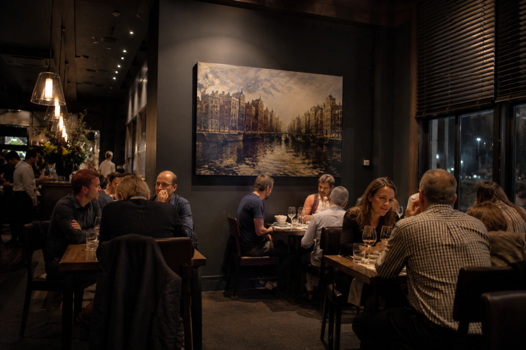
Warm evening lighting and carefully chosen artwork can turn a restaurant interior into a space that guests remember long after the meal ends
Your walls are either working for you or against you. Most restaurant owners spend months agonizing over menu design, table layouts, and lighting rigs – then hang whatever was on sale at the nearest homeware store. The result is a dining room that feels like a waiting room.
That’s a real business problem. A 2025 peer-reviewed study published in PLoS ONE by Rathnasiri et al. confirmed that all atmospheric constructs except music significantly affect whether customers return. Decor, visual environment, and layout directly influence repeat visit behavior. What you put on your walls isn’t decoration – it’s part of what keeps seats filled.
This guide gives you a practical framework for choosing, sizing, and placing restaurant wall art so it works as hard as your menu does.
Why Restaurant Art Is a Business Decision, Not Just Decoration
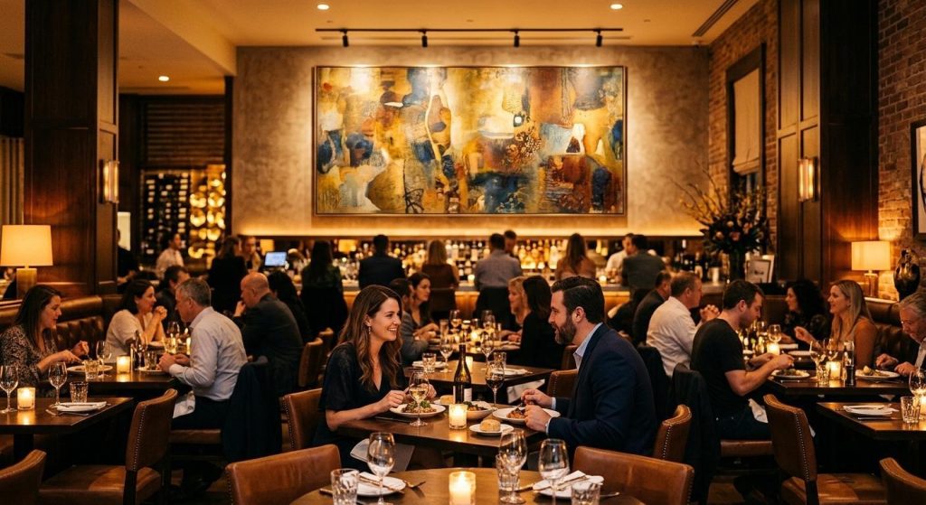
A statement canvas on the feature wall sets the mood before diners read a single word of the menu
The numbers make the case plainly. According to the OpenTable 2026 Diner Trends Report, 48% of Americans say “cozy, local charm” is the most appealing interior style for a restaurant – it topped every other option. The same report found that 54% of Americans are willing to pay a premium for a one-of-a-kind dining experience. That’s not a minor preference. That’s a measurable pricing lever.
It gets more specific than atmosphere. OpenTable also found that 58% of Americans say they’d choose a visually striking restaurant over a less aesthetic option, with 25% calling social media appeal “extremely important.” When a guest photographs your space and posts it, you’re getting free advertising that a billboard can’t match.
Then there are the less obvious gains. Large canvases and fabric-wrapped panel artworks absorb mid-frequency sound, reducing that wall-of-noise effect common in busy service environments. Customers talk more comfortably, they stay longer, and longer stays produce more dessert and drinks orders.
Formats matter here, too. horizontal art designed for wide walls – such as those behind banquette rows or above open-plan dining areas – creates a natural visual anchor without competing with ceiling height. A single wide piece reads as intentional. A collection of mismatched small frames reads as indecision.
How to Match Art Style to Your Restaurant’s Identity
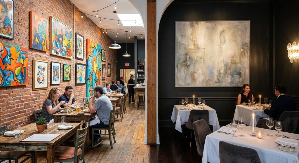
The art style should match the dining concept – bold and energetic for casual venues, restrained and sophisticated for fine dining
Restaurant type should drive art tone – not personal taste alone. The two don’t always align, and when they don’t, the room feels off even if guests can’t name why.
For fine dining rooms, the right choice is usually large-format abstract or representational work in muted or neutral palettes. A single piece as a focal point carries more weight than a cluster. It signals restraint and confidence, which is exactly what a high-spend diner wants to feel in their environment.
For casual bistros and neighbourhood spots, you have more room to play. Bold color, playful illustration, and gallery-wall clusters all work – as long as there’s a cohesive thread running through the selections, whether that’s palette, subject matter, or frame style.
Farm-to-table and community-focused concepts benefit from local artist commissions or botanical and landscape subjects. The provenance of the art becomes part of the story your staff can tell.
Theme-driven restaurants need the most careful curation. A restaurant built around fusion cuisine needs art that reflects the cultural story of its menu – generic still lifes won’t reinforce that identity.
One useful test: can a diner describe the art to a friend the next day? If yes, it’s doing its job. If it’s forgettable, it’s a missed opportunity. Art is just one piece of what makes a guest want to come back – the same attention to detail that goes into creating a memorable dining experience applies to every surface in your room.
Getting the Format and Scale Right
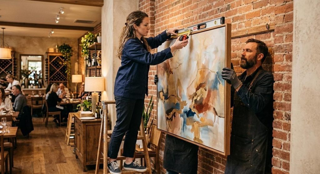
Proper placement centers most pieces at eye level – roughly 57 to 61 inches from the floor – for comfortable sightlines across seating areas
The size of the artwork matters just as much as the style. Pieces that are too small disappear into the room, while oversized work can overwhelm tables and sightlines. Before deciding where art goes, make sure the scale feels proportionate to the wall and the furniture around it.
Feature Walls and Entrances
The entrance sets the tone before a single dish arrives. Large single pieces or triptychs work best here – they stop movement and give guests something to register immediately. For impact, aim for a minimum of 48 by 60 inches. Long dining walls can carry groupings or wide horizontal canvases that follow the room’s geometry.
Above Banquette Seating
Horizontal format is the right call for banquette runs. The art should echo the linear geometry of the seating rather than fight it. As a rule, the art’s width should span at least two-thirds of the furniture below it. A piece that’s too narrow over a long banquette looks like an afterthought.
Corridors and Restroom Areas
Don’t leave these blank. Smaller-format works or a consistent series of prints keep the visual story running through the whole venue. Dead zones in corridors break the experience that the main dining room builds.
Placement rule: hang the center of the piece at 57 to 61 inches from the floor. This is the standard gallery height because it hits comfortable sightlines for both seated and standing guests. According to a 2025 placement guide from The Rail, this rule holds for restaurant spaces across formats – it’s as applicable above a banquette as it is at a gallery entrance.
Lighting: use warm-white bulbs in the 2700 to 3000K range with picture rails or adjustable track lighting. This range lifts color naturally and keeps skin tones warm. Cooler light sources flatten artwork and can make a dining room feel clinical.
Choosing Colors That Work With Your Lighting and Palette
Color in restaurant art isn’t just an aesthetic preference – it has measurable effects on how guests behave in the space.
Warm tones, such as reds, ochres, and burnt oranges, stimulate energy and conversation. They’re the right call for high-turnover casual dining where you want tables cycling efficiently. The downside is that they can feel aggressive in a quiet, intimate setting.
Cool tones, such as blues, sage, and slate, encourage relaxation and longer stays. Fine dining rooms and weekend brunch concepts benefit most from this palette. If your average check depends on second drinks and extended service, a cooler-toned art palette helps sustain the mood.
Neutral and monochromatic artworks let the food and plating become the color story. This is the safest option for restaurants with seasonal menu changes or rooms that get used for both lunch service and private dining.
Don’t match the art to the wall color. Contrast creates definition. Art that blends into a wall disappears, which defeats the whole purpose. Consider the light source, too: north-facing rooms run cool and benefit from warm-toned art as a correction. South-facing rooms with strong natural light need less intervention.
Where to Source Art That Works for Commercial Spaces
Horizontal format canvases work especially well across wide restaurant walls and above banquette seating
The sourcing decision depends on your venue type and how many locations you’re fitting out.
Local artist commissions are the strongest option for flagship venues. They give you authenticity, a community story, and a natural talking point for front-of-house staff. Many local artists are open to rotating exhibit arrangements, which keeps the walls fresh without a full refurbishment spend.
For multi-location operators, print-on-demand canvas suppliers produce consistent quality at predictable cost. You maintain brand coherence across sites without the logistical complexity of sourcing individually at each location.
Online art retailers that specialize in hospitality supply commercially licensed pieces and often handle custom sizing. This closes the gap between “I love this piece” and “this piece fits my 14-foot wall.”
On budget: art is a one-time fit-out cost with a long lifespan. Compare it to what you spend on furniture. According to Restroworks’ Global Restaurant Industry Statistics 2025, 64% of full-service restaurant diners globally prioritize experience over price. Art is a direct investment in what drives that preference. A statement piece that lasts a decade costs less per year than a mid-range chair that gets replaced in five.
When to commission versus buy: commission for brand-defining flagship spaces where the story of the art matters. Buy existing work for secondary spaces, rollouts, and corridors where consistency and cost efficiency take priority.
Good guidance on choosing restaurant furniture applies directly here: art and furniture need to coordinate, not just coexist. A sleek minimalist dining room fitted with ornate baroque prints creates visual dissonance that guests feel even if they can’t name it.
Common Mistakes Restaurant Owners Make With Wall Art
A few errors appear again and again in restaurant fit-outs:
- Hanging too high. Art positioned above eye level feels disconnected from the space. It reads like wallpaper rather than a design choice. Keep the center at the 57-to-61-inch mark even when the ceiling is high.
- Art that’s too small for the wall. A single 12-inch print on a 10-foot wall doesn’t anchor anything. It creates dead space around itself. Go bigger than you think you need, or create a properly composed grouping with consistent spacing.
- Generic stock prints. Art that has no relationship to your restaurant’s story signals that no one thought about it. Diners notice. They may not consciously articulate it, but it contributes to a feeling of inauthenticity that affects satisfaction scores.
- Ignoring maintenance requirements. Canvas can yellow in kitchens where grease vapor circulates. Near food preparation zones or pass-through areas, use sealed or acrylic-varnished pieces that can be wiped down. A deteriorating canvas does more damage to a room than no canvas at all.
- Mixing unrelated styles without a cohesive thread. Variety is fine. Visual chaos isn’t. If your collection spans three continents and four centuries, give it a connective element – palette, framing, or scale – that makes it feel curated rather than accumulated.
- Ignoring the social media angle. At least one wall in any venue should be photograph-worthy. This doesn’t mean a neon sign. It means a composition that photographs well from table height with a phone.
The Walls Remember What the Food Can’t Say
Restaurant wall art isn’t a finishing touch. It’s infrastructure. The data from the OpenTable 2026 Diner Trends Report and the Rathnasiri et al. PLoS ONE study both point to the same conclusion: visual environment shapes behavior, willingness to return, and willingness to pay.
The best art choices don’t announce themselves. They make guests feel at home, extend their stays, and give them something worth photographing and sharing. That’s not a decorative outcome, it’s a commercial one.
Start with your restaurant’s identity. Let that drive format, scale, and palette. Then hang it at the right height, light it properly, and leave at least one wall that a guest will want to photograph. That’s a complete brief – and it doesn’t require a big budget to execute well.